이 글은 이것이 안드로이드다 with 코틀린(개정판)를 참고하여 작성하였습니다.
작성자 : 김준욱
개발환경은 Windows, Android Studio입니다.
1. View 클래스 이해와 CustomView
우리가 Palette에서 끌어다 사용하거나, 코드의 태그를 통해 쉽게 사용하는 Textview, Imageview 등은 모두 View라는 클래스를 상속받고 있습니다.
그리고 View 클래스는 내부에 onDraw라는 함수를 통해 화면에 글자나 기타 데이터들을 출력시켜 줍니다.

이번 시간에는 View클래스를 상속받은 나만의 CustomView를 만들어 글자와 도형을 출력해보겠습니다.
2. CustomView 만들어 보기
먼저 View를 상속받은 CustomView 클래스를 생성하고 onDraw 함수를 오버라이드 합니다.

그 후 onDraw 함수에서 내가 작성할 글자의 속성을 Paint 클래스를 통해 지정해줍니다.
글자의 색상을 설정할때는 paint.color를, 글자의 크기를 설정할때는 paint.textSize를 이용해줍니다.
이를 이용해 "안녕하세요" 텍스트를 출력하는 코드를 작성해보겠습니다.
//CustomView.kt
class CustomView(context: Context) : View(context) {
    override fun onDraw(canvas: Canvas?) {
        super.onDraw(canvas)

        val paint = Paint()
        paint.color = Color.BLACK		//글자의 색상 = black
        paint.textSize = 100f			//글자의 크기 = 100f

        canvas?.run{
            drawText("안녕하세요", 100f, 100f, paint)
        }
    }
}
이렇게 만들어진 CustomView를 MainActivity에서 출력해보겠습니다.
MainActivity에서는 비어있는 framelayout을 생성해 CustomView를 add하는 방식으로 CustomView를 출력합니다.
물론 viewBinding 설정은 미리 해두셔야 합니다!
//MainActivity.kt
class MainActivity : AppCompatActivity() {
    val binding by lazy{ActivityMainBinding.inflate(layoutInflater)}

    override fun onCreate(savedInstanceState: Bundle?) {
        super.onCreate(savedInstanceState)
        setContentView(binding.root)

        val customView = CustomView(this)
        binding.frameLayout.addView(customView)
    }
}
이제 에뮬레이터를 실행시켜 보면 미리 지정해둔 framlayout 영역에 우리가 출력한 "안녕하세요" text를 확인할 수 있습니다.

같은 방법으로 canvas의 다양한 내장함수를 통해 도형을 구현할 수도 있습니다.
class CustomView(context: Context) : View(context) {
    override fun onDraw(canvas: Canvas?) {
        super.onDraw(canvas)

        val paint = Paint()
        paint.color = Color.BLACK
        paint.textSize = 100f

        canvas?.run{
            drawText("안녕하세요", 100f, 100f, paint)
            customDrawCircle(canvas)
            customDrawRect(canvas)
        }
    }

    fun customDrawCircle(canvas:Canvas) {	//원을 그리는 함수
        val paint = Paint()
        paint.style = Paint.Style.FILL		//내부를 채운다
        paint.color = Color.BLUE

        canvas.drawCircle(150f, 300f, 100f, paint)
    }

    fun customDrawRect(canvas:Canvas) {		//사각형을 그리는 함수
        val paint = Paint()
        paint.style = Paint.Style.STROKE	//바깥선만 그린다
        paint.strokeWidth = 20f
        paint.color = Color.GREEN

        val rect = Rect(50, 450, 250,650)
        canvas.drawRect(rect, paint)
    }
}

3. CustomWidget 만들어 보기
CustomWidget이란 미리 구현되어 있는 widget들이 아닌 나만의 widget을 만들어 사용하는 것을 뜻합니다.
이번에 만들어 볼 customwidget은 날자를 뜻하는 문자열(ex. 19970428)을 자동으로 구분자를 넣어주는(ex. 1997-04-28) widget을 만들어 보겠습니다.
1) 속성 xml 파일(attrs.xml) 생성하기
먼저 우리가 만들 customwidget의 속성을 정의할 xml 파일을 생성합니다.
그리고 그 파일에 속성을 정의합니다.
우리는 구분자를 넣을 변수를 "delimeter", 그리고 "delimeter"라는 속성이 사용할 데이터 타입을 format에 적어줍니다.
<?xml version="1.0" encoding="utf-8"?>
<resources>
    <declare-styleable name="CustomText">
        <attr name = "delimeter" format = "string"/>
    </declare-styleable>
</resources>
2) CustomWidget 클래스 생성하기
AppCompatTextView를 상속받은 CustomText 클래스를 생성합니다.
AppCompatTextView는 3가지 생성자를 가지고 있으므로 CustomText도 3가지 생성자를 보조생성자를 통해 만들어줍니다.

//CustomText.kt
class CustomText : AppCompatTextView {
    constructor(context: Context) : super(context) { }
    constructor(context: Context, attrs: AttributeSet) : super(context, attrs) { }
    constructor(context: Context, attrs: AttributeSet, defStyleAttr: Int) : super(context, attrs, defStyleAttr) { }
}
우리는 3가지 생성자중 2번째 생성자를 이용해 우리가 원하는 기능을 구현해 볼 것입니다.
constructor(context: Context, attrs: AttributeSet) : super(context, attrs) {
        val attrList = context.obtainStyledAttributes(attrs, R.styleable.CustomText)
        val size = attrList.indexCount

        for(i in 0 until size) {
            val attr = attrList.getIndex(i)
            when(attr) {
                R.styleable.CustomText_delimeter -> {
                    attrList.getString(attr)?.let{
                        delimeter_process(it)
                    }
                }
            }
        }
    }
여기서 attrs에는 모든 속성이 담겨 오는데 그 중에서 우리가 CustomText에서 정의한것만 따로 attrList에 저장합니다.
그리고 그 속성의 갯수를 size라는 변수에 저장합니다.
for문을 돌면서 만약 속성이 delimeter 일때 처리할 함수 delimeter_process를 구현해봅시다.
fun delimeter_process(delimeter: String){
        if(text.length == 8) {
            val first4 = text.substring(0, 4)
            val mid2 = text.substring(4, 6)
            val last2 = text.substring(6)

            text = first4 + delimeter + mid2 + delimeter + last2
        }
    }
년, 월, 일 사이에 delimeter를 끼워넣은 폼을 반환하는 delimeter_process를 만들어 보았습니다.
이제 MainActivity에 이를 적용해보는 일만 남았습니다!
3) ActivityMain에 적용하기
activity_main.xml파일에 코드형태로 customtext를 추가해줍니다.
//main_activity.xml
<com.example.customwidget_blog.CustomText
        android:layout_width="wrap_content"
        android:layout_height="wrap_content"
        android:text="19970428"
        android:textSize="24sp"
        app:layout_constraintBottom_toBottomOf="parent"
        app:layout_constraintEnd_toEndOf="parent"
        app:layout_constraintStart_toStartOf="parent"
        app:layout_constraintTop_toTopOf="parent" />
그리고 Design에서 우리가 추가한 속성 delimeter를 지정합니다.(코드를 이용해 직접 추가해도 괜찮습니다.)
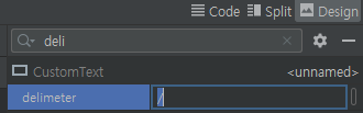
그 후 에뮬레이터를 실행시키면 우리가 입력한 텍스트는 19970428 이지만 자동으로 delimeter가 삽입된 모습을 볼 수 있습니다.

'GDSC HUFS 3기 > Android with Kotlin Team 4' 카테고리의 다른 글
| [4팀] 14-10. 화면 구성하기:탭메뉴 뷰페이저와 리사이클러뷰 (0) | 2021.11.16 |
|---|---|
| [4팀] 14-9. 화면 구성하기:탭메뉴 뷰페이저와 프래그먼트 (0) | 2021.11.16 |
| [4팀]14-5~6 화면 구성하기:프래그먼트, 프래그먼트끼리 값 주고받기 (0) | 2021.11.09 |
| [4팀]14-4. 화면 구성하기:리사이클러뷰 (0) | 2021.11.08 |
| [4팀]14-2~3. 화면구성하기:스피너 (0) | 2021.11.08 |